Welcome to the MotionLayout Workshop
Introduction
ConstraintLayout 2.0 is a library that provides you with a rich set of features for building UI:
- ConstraintLayout - a rich layout framework
- MotionLayout - an animation Layout based on ConstraintLayout
- Smaller related tools (such as Helpers, and ImageFilterView)
MotionLayout is a library that lets you add rich motion into your Android app. It's based upon ConstraintLayout and lets you animate anything that you can build using ConstraintLayout.
You can use MotionLayout to animate the location, size, visibility, alpha, color, elevation, rotation, and other attributes of multiple views at the same time. Using declarative XML you can create coordinated animations, involving multiple views, that are difficult to achieve in code.
MotionLayout animations extend many of the same concepts as Keyframe animations with Constraint Layout to allow you to finely customize the animation.
In this codelab, you will learn the basics of MotionLayout and how to use it to build rich animations in your app.
Why animate?
Animations are a great way to enhance an app experience. You can use animations to:
- Show changes—animating between states lets the user naturally track changes in your UI.
- Draw attention—use animations to draw attention to important UI elements.
- Build beautiful designs—effective motion in design makes apps look polished.
What you should already know
What you'll need
What you'll learn
- How to define an animation with ConstraintSets and MotionLayout
- How to animate based on drag events
- How to change the animation with KeyPosition
- How to change attributes with KeyAttribute
- How to run animations with code
- How to animate collapsible headers with MotionLayout
When you are done, give us feedback!
Link:
https://forms.gle/YQc62Wz7U9YKQuXQ6
Or, Scan this barcode:

Part 1 Build a rich animated ui using the MotionEditor
The goal is to show you how to create a complex animated home screen with several ConstraintSets representing states in your application.
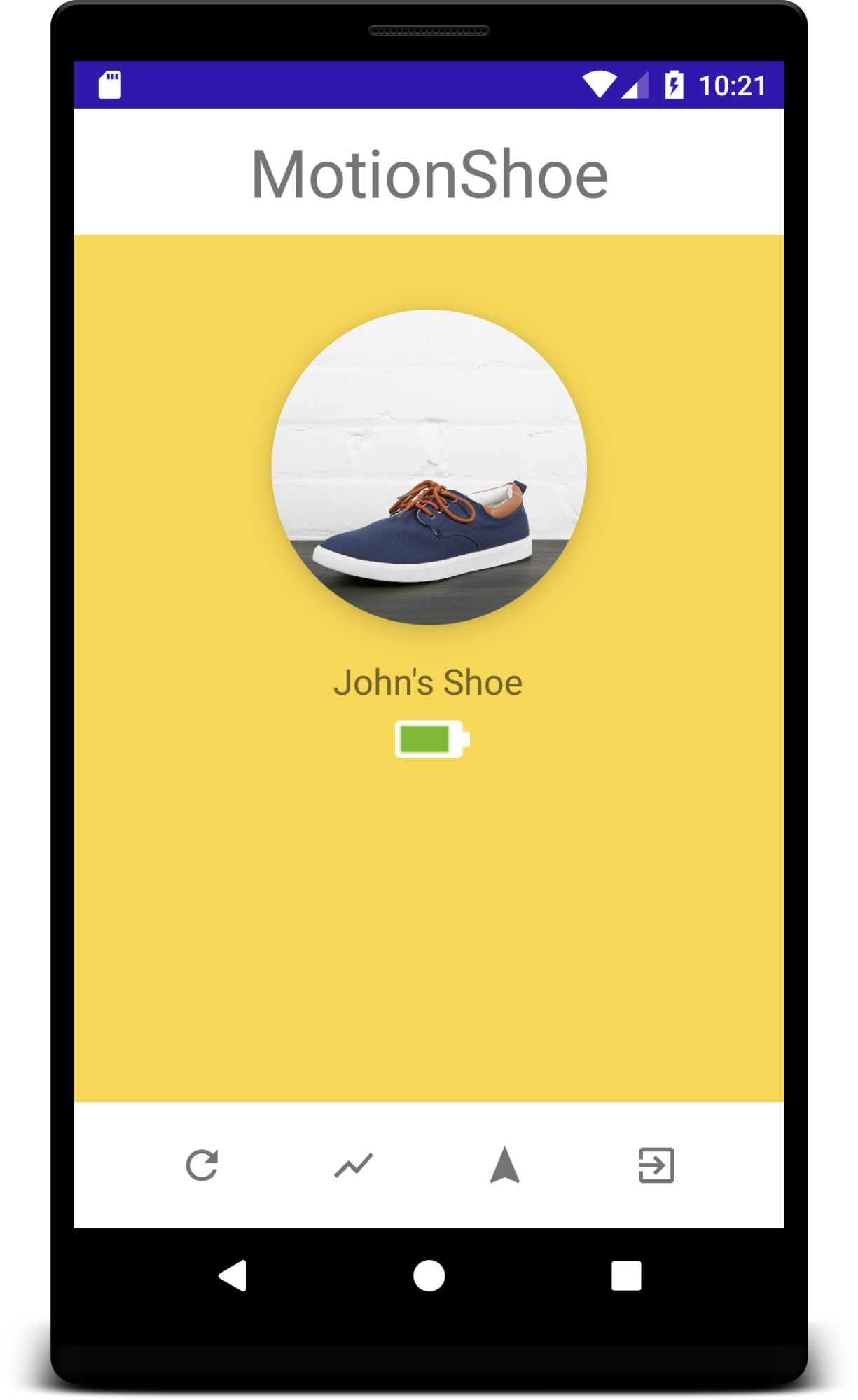
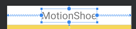
The fictional application called MotionShoe is an
Internet connected shoe. This type of work flow is typical of many apps that connect to devices.
Build the Main screen using ConstraintLayout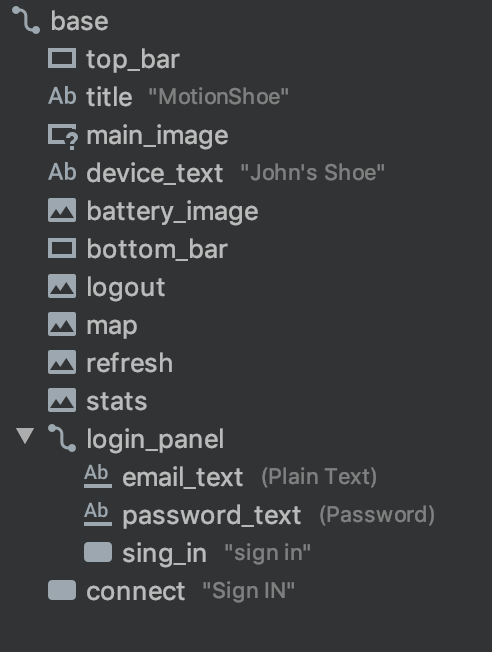
Open activity_main.xml.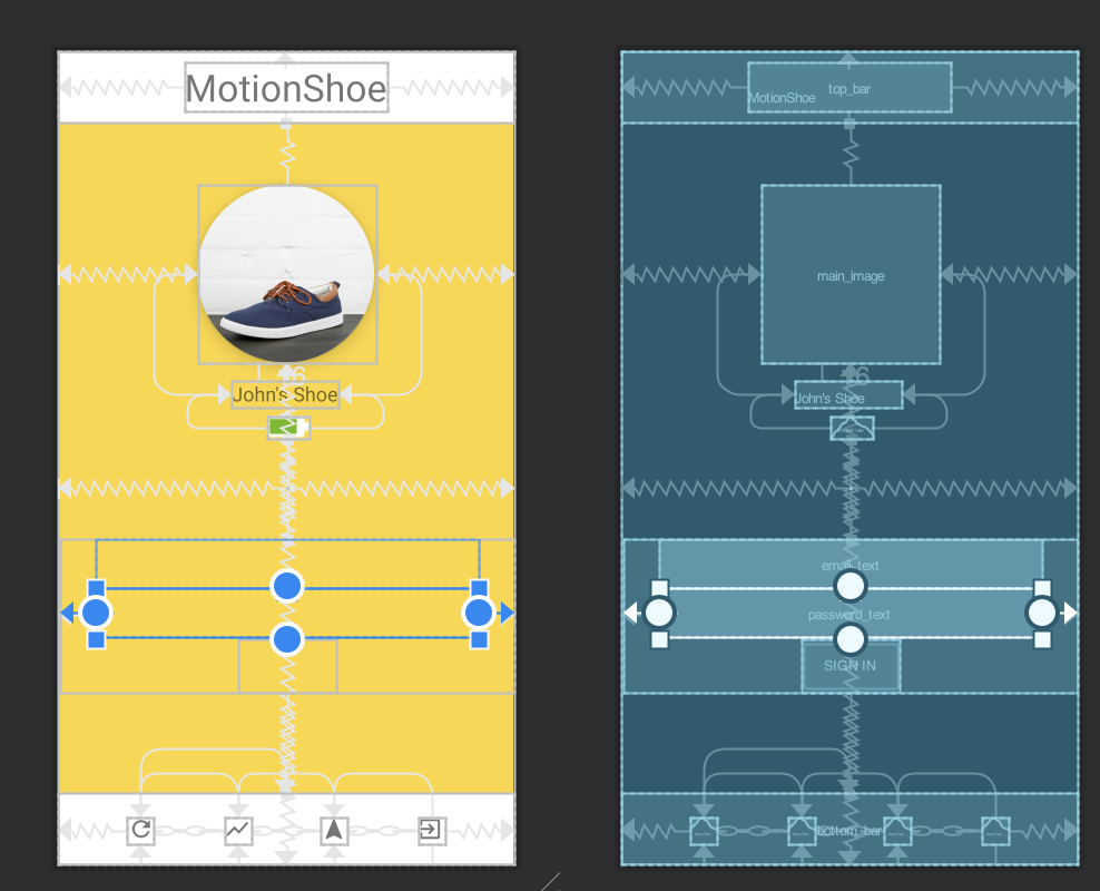
The layout is already built for you.
It uses several different styles to illustrate the flexibility of ConstraintLayout.
Convert to MotionLayout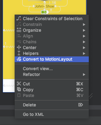
- Go to design of activity_main.xml
- Right click on the base MotionLayout (id:base) select convert to MotionLayout
This will do several things for you:
- Change ConstraintLayout to MotionLayout
- Create res/xml/main_activity_scene.xml
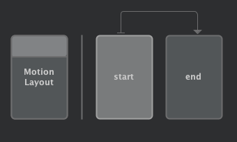
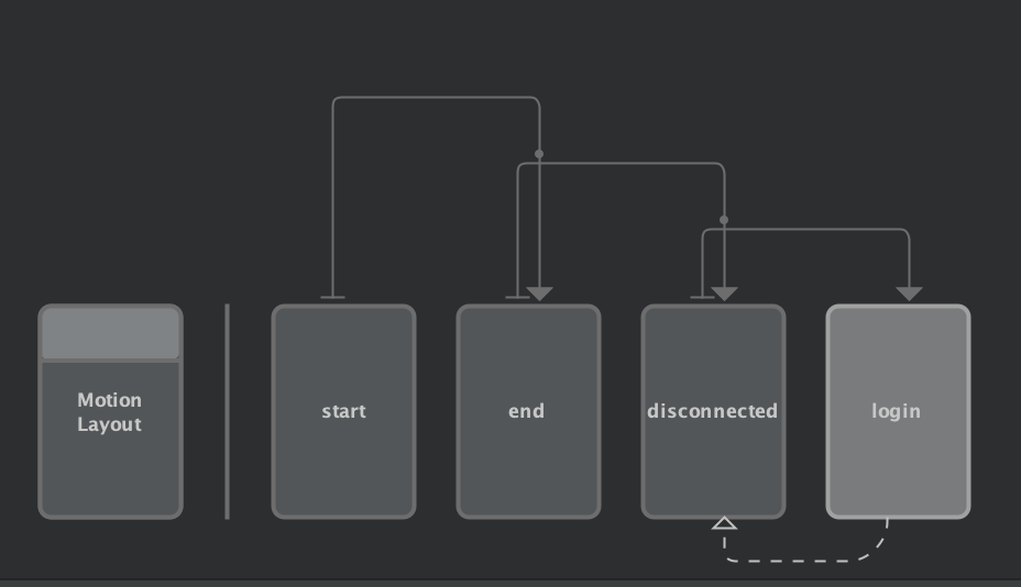
The file the will control the animation - In main_activity_scene.xml it will create:
- start constraintSet
- end constraintSet
- A Transition between start & end
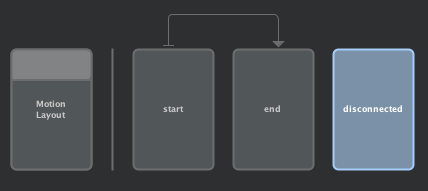
The screen should now display the MotionEditor.
The overview panel gives you a graphical description of the transitions and constraintSets you have.
Create a fly-in effect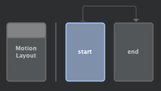
The goal is for you to provide a cool animation on start up.
Select the start constraintSet
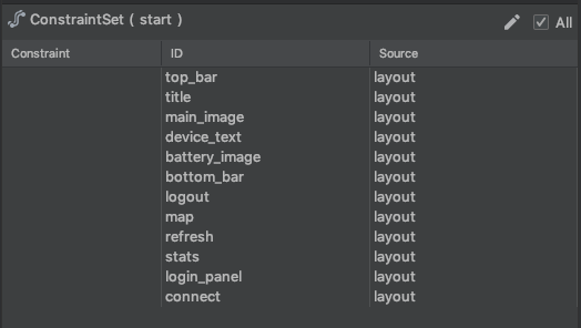
Notice
All the views are constrained in the main layout:
Select each view and get them repositioned off screen.
The can be done by 2 ways:
- Add a translateX or translateY to each view
- Change the constraints
Adding Translate
- Select the title
- On attribute panel hit “+”
- Type translationY -300dp
- Notice the title says its source is now start:
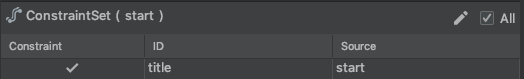
You should read this as: In constraintset [id] start the view [id] title is constrained in constraintset start.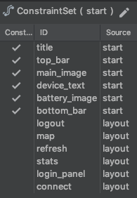
- Move all other view off the screen
- top_bar translationY : -300dp
- main_image alpha: 0.0 (and set its layout_width to 300dp)
- device_text translationX: -500dp
- battery_image translationX: 500dp
- bottom_bar remove the bottom_toBottom=parent constraint and add a top_toBottom=parent
- All views should be off screen.
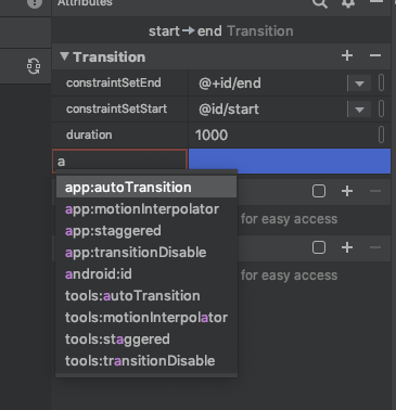
- Select transition (using the overview panel) and add autoTransition: animateToEnd
That’s it! Hit run app!
Creating an offline state
Even simple apps like this can have many states. Our next step is to create a state where the app is not connected to our fancy online shoe.
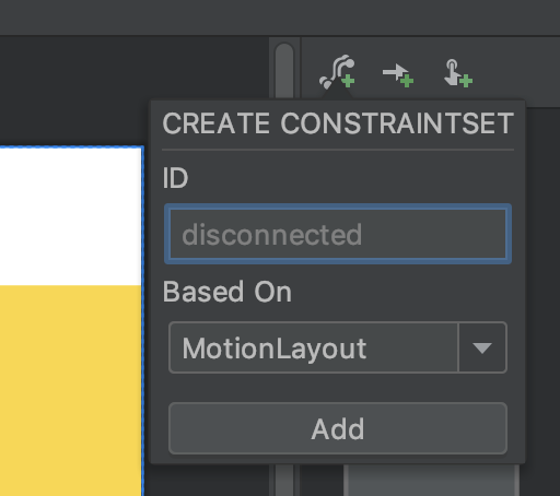
- Create new ConstrainSet by selecting the create constraintSet icon

- Set its id to “offline”, then add it
- Select the newly-created “offline state
- Select the connect button (currently gone) using the component tree
- Set visibility to visible
- Make a few additional changes in that state:
- battery_image visibility: invisible
- device_text visibility: invisibile
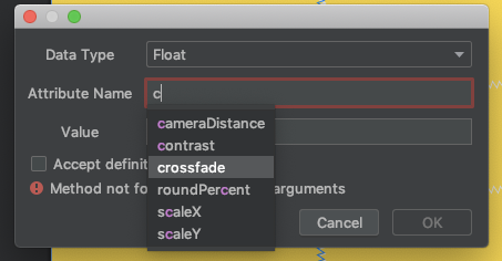
- main_image custom attribute
- Select main_image
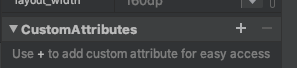
- Add a custom attribute
- Select data type: float
- Select crossfade 1.0
- Switch to end ConstraintSet
- Add custom attribute crossfade 0.0 to main_image in end ConstraintSet
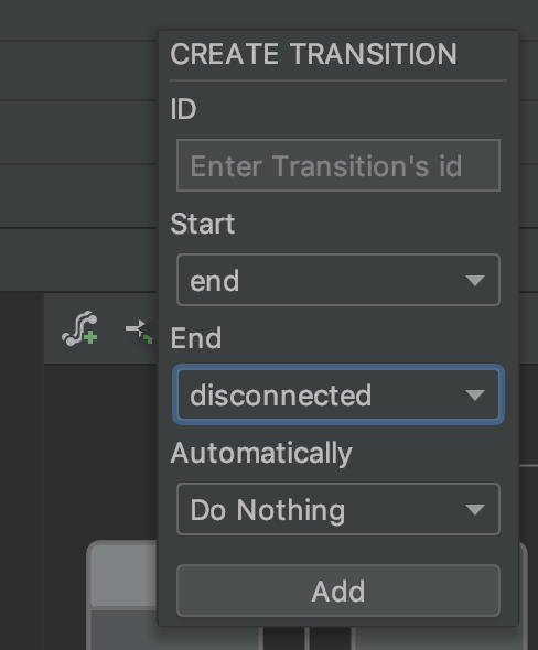
- Add Transition

- Set Start to : end
- Set End to : disconnected
- Select [add]
- Add OnClick handler
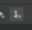
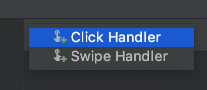 select [click Handler]
 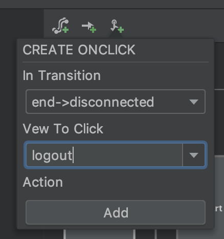 select logout
With the click handler set, the logout button (bottom right) will take you to the offline state. Run the app!
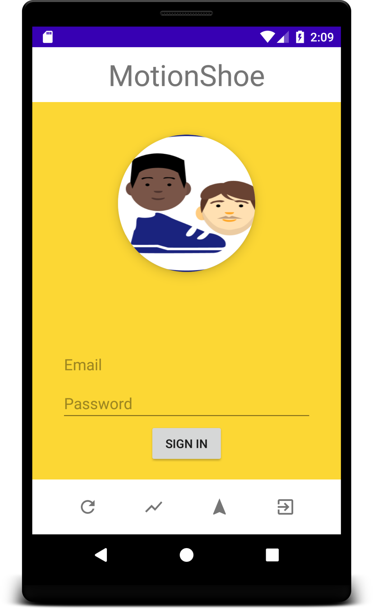
Create login screen
Assuming you have gone through the above steps we can go a little faster.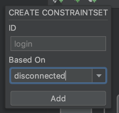
- Add new ConstraintSet named “login” based on disconnected
- Select sub panel login_panel and set it to visible
- Select Button connect and set it to invisible
- Add a transition from offline to login
- Add a click handler for that transition on the connect button
- Run the app, logout and try to log in again!
Note:
By deriving the login constraintSet from the offline constraintSet we are able to base the login screen on changes from the offline screen. This reduces the effort and makes it easier to maintain.
Adding the login callback
Often we will want to control a specific transition from code. For example, when clicking on the “sign in” button we want the code to verify the login information, and execute a transition to the home constraintSet (“end”) or fail and go back to offline.
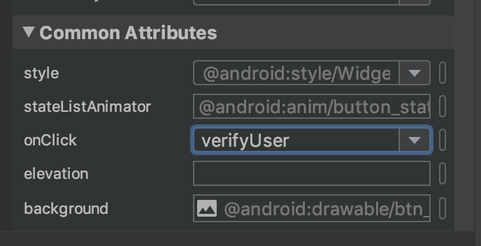
- Select the login constraint set
- Select the “SIGN IN” button (sign_in) inside the login_panel component
- Under Common Attributes
set the onClick property to “verifyUser” - Add a function “verifyUser” to MainActivity
fun verifyUser(view: View) { var layout = findViewById<MotionLayout>(R.id.base) var email = findViewById<EditText>(R.id.email_text) if (email.text.toString().equals("john")) { // todo real verification layout.transitionToState(R.id.end); } else { layout.transitionToState(R.id.disconnected) } } |
- Run and test the application:
- click disconnect
- click sign in
- enter “john” as the email
- voila!
Note: while this will work, despite having no transition between the login and end ConstraintSets, we certainly can make that transition more interesting to help indicate a successful connection.
Creating the “login successful” transition
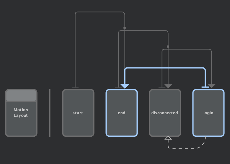
(login->end)
- Create a new transition (
 ) between login and end
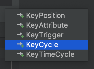
- Select that new transition
- add a duration attribute and set it to 5000 (5s)
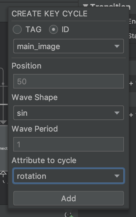
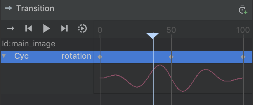
- Add 3 keyCycles on at positions 0, 50, 100
- Select KeyCycle
- Select main_image as id
- Set position to 50
- Set “Attribute to cycle” to be rotation
- Set the rotation to 90
- Add the key cycle
- Repeat for the other two positions (0 and 100)
- Select key cycle 0 (then 100)
- Set the rotation attribute to 0
Now that you have had a quick introduction to KeyCycle, you can explore various other Keyframe types … and let your imagination go wild!